

The right unique room decor idea depends on how much of the room you are willing to rebuild versus how much you want to swap in by Sunday afternoon. A statement headboard reaches two-thirds up an eight-foot ceiling or the eye wakes to drywall instead of intention, while peel-and-stick wallpaper on one bold wall can commit for a weekend and peel off when the lease ends.
1. Statement Headboard
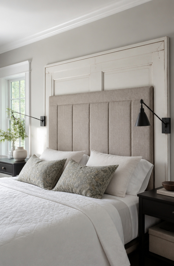
A headboard that carries the room replaces every other competing focal point, which is the point. Clutter on nightstands and busy gallery walls above the bed suddenly read as noise when one large piece does the visual heavy lifting. For standard eight-foot ceilings, the headboard should reach at least two-thirds up the wall or the eye wakes to drywall instead of intention. Taller rooms can take something architecturally scaled, but a low board in a high space looks like a raft drifting in open water.
The afternoon project is real. A plywood cut to size, foam from the craft store, and a staple gun will get you an upholstered shape by dinner. A vintage door, stripped and matte-finished, hangs on French cleats in about the same time. The mistake I keep seeing, and what stopped me the first time, is going too small. A queen bed swallows a board meant for a twin. Measure the mattress width, then add visual weight; the frame and bedding will eat into the edges, and waking up to visible wall on both sides defeats the whole purpose.
2. Layered Bedding
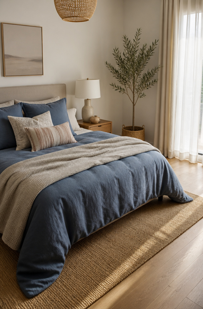
A single matched set reads flat against a wall, but two or three visible layers give the bed depth you can actually see from the doorway. The 60-30-10 rule keeps the colors from fighting: 60% dominant, 30% secondary, 10% accent, distributed across your sheets, duvet, and that top throw. Textures do the heavy lifting when patterns would clash. Last spring I laid out four competing prints at once, and the bed looked like a rummage sale. Stripped it back to a solid linen duvet, a waffle-weave blanket, and one striped accent pillow. The difference was immediate.
Leave 60–70 cm of walking space around the bed for circulation. Anything tighter and you’re shimmying past the nightstand every morning.
3. Space-Saving Lighting
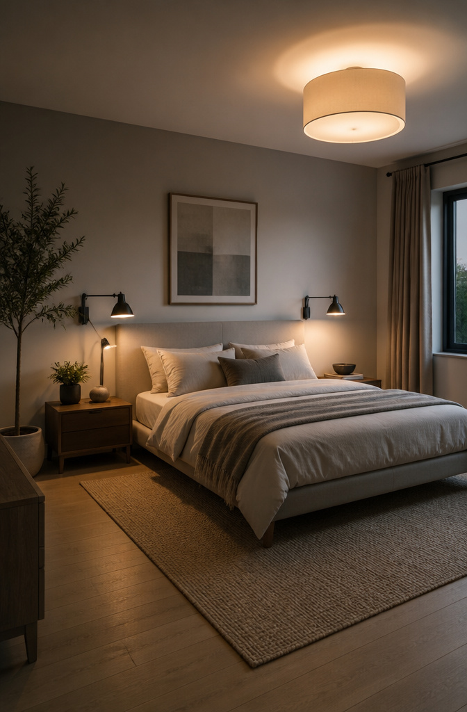
Wall-mounted sconces and pendant lights do the one thing a table lamp can’t: they give back the surface. In a bedroom that’s tight on square footage, swing-arm sconces beside the bed mean the nightstand can hold a book and a glass of water instead of competing with a light base. The arm lets you adjust the angle for reading, then push it flush against the wall when you’re done.
For renters or anyone avoiding electrical work, clip-on reading lights that mount to the headboard or shelf serve the same purpose without the drywall commitment. The cord is the messy part, and the fix is a shallow raceway painted to match the wall. It runs straight down to the outlet and reads as trim if you stand back more than a few feet.
Layered lighting is what makes the room actually work: ceiling fixtures for ambient light, sconces or pendants for task work, and whatever third source you have, a strip or a small accent lamp, for depth. One fixture trying to do all three washes everything flat and leaves shadows where you need to see. Three sources at different heights let you dim or brighten by activity, not by what a single switch allows.
4. Multipurpose Furniture
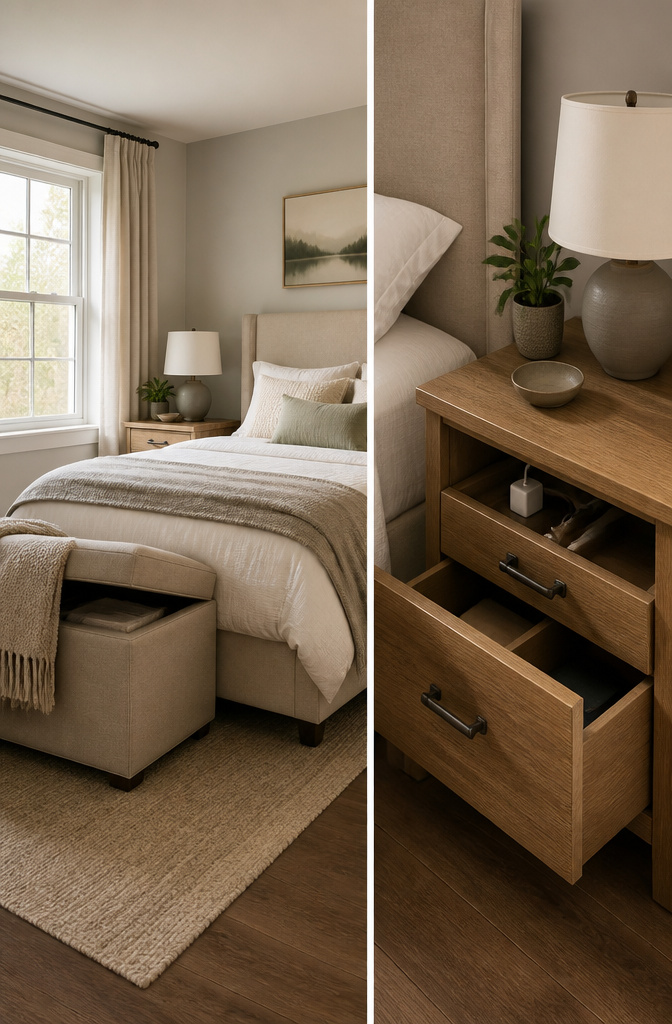
In rooms under 120 square feet, every piece earns its footprint by doing at least two jobs. An ottoman storage bed swallows extra bedding where a closet won’t fit. Nightstands with charging drawers keep cords off the floor and phones within arm’s reach. I used a folding desk for two years before the hinge gave out, and natural finishes and warm wood tones are where the current material direction is headed. The desk taught me that hardware wears out before the wood does, so the finish matters more than the fold.
5. Feature Wall
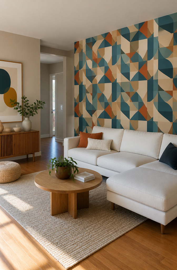
One bold surface carries the room; four makes none of them matter. Peel-and-stick wallpaper comes in enough patterns now that you can commit for a weekend and peel it off when the lease ends. Limewash paint gives that soft, chalky depth the 2027 color forecasts keep pointing toward, and it hides wall imperfections better than flat paint. Wood slat panels add warmth through shadow, not just grain, and the gap spacing between slats is what determines how deep that shadow reads. A ½-inch gap reads subtle; 1½ inches throws dramatic stripes by afternoon light.
The common error is stopping at the corner. The wall ends, and so does the effect, leaving the room chopped in half visually. Wrapping the treatment onto the next wall, even just 12 to 18 inches, lets the eye travel and the space feel intentional. I learned this the hard way on my first attempt, where the wallpaper stopped so cleanly at the corner that the whole wall looked like a backdrop instead of architecture. The fix cost an extra roll and an hour, but wrapping to the next wall for continuity changed it from stage set to room.
6. Oversized Mirror

A mirror can double the light in a room without adding a single watt. Light bounces off the glass, carrying whatever it hits back into the space, which makes a cramped corner feel like it has somewhere to go.
Leaning a heavy mirror against the wall skips the hardware question entirely. The frame sits on the floor, angled enough to catch window light, and you can shift it when the sun moves. Wall mounting demands more care. The frame itself tells you what hardware you need, not your guess at how heavy it feels. A picture hook rated for 20 pounds will bend under a 35-pound frame, and the wall behind it will dent before the hook fails. I learned that the hard way in a hallway that still carries the scar.
Placement matters more than size. Opposite a window, the mirror pulls daylight deep into the room. Opposite a cluttered desk or an open closet, it doubles the mess you meant to hide. The reflection becomes the view, so give it something worth showing.
7. Botanical Elements

Living plants do something no lamp or pillow can pull off: they clean the air while adding texture that changes by the week. For vertical space, a hanging planter draws the eye up and keeps floor areas clear. Tabletop succulents forgive owners who forget water for two weeks straight. Trailing plants on floating shelves combine the lift of elevation with a cascading line that softens the whole wall.
My own pothos died from overcare, not neglect. I watered on a schedule instead of checking the soil, and root rot set in before the leaves even yellowed. Now I lift the pot to feel its weight; light means thirsty, heavy means wait. A dry finger pushed two inches into the soil works just as well.
8. Accent Furniture That Pops

Painted side tables in colors you would not expect, sculptural stools that look more like gallery pieces than seating, and ceramic garden stools dragged in from the patio all do the same job: they break the eye’s assumption that everything in a room belongs to the same story. I kept an orange ceramic garden stool beside my bed for a year, then moved it to the living room as a plant stand, then beside the sofa as a drink perch. The glaze caught light differently in each spot, and the shape was round against every straight line nearby, so it read as intentional rather than leftover.
The trick is one piece per room. Two bright or odd shapes compete, and the room starts to look like a clearance section. One reads as a decision. Wood, rattan, and metal mixed together work because the single pop unifies them; your eye goes to the orange stool or the cobalt table first, then notices the materials around it. A statement chair works the same way, anchoring a corner without asking the walls to change.
9. Vintage Accents and Retro Details
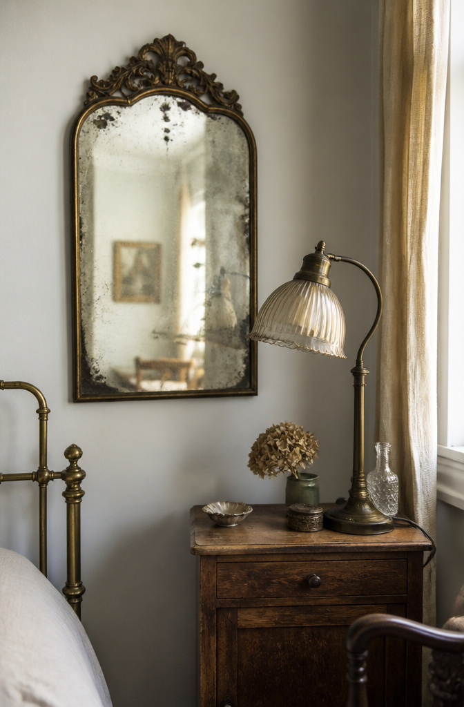
An antique mirror with honest foxing, the kind that blooms from silver backing breaking down over decades, throws light in a way no factory distressing copies. The spots move as you move; they hold the room’s history in real time. That unpredictability is the whole point.
I found a 1960s desk lamp at a garage sale, brass gone dull green, cloth cord crumbling where the dog had chewed it. A $12 rewiring kit and twenty minutes with a screwdriver put it back in service. The warm light through its original amber glass does something LED retro fits never manage; the color temperature is off by enough degrees to matter.
Heirloom furniture carries the same weight. Wear patterns on drawer pulls, the soft dip where a hundred hands pressed the same edge: these are fingerprints you cannot manufacture.
The mistake is over-collecting. Three eras in one room becomes storage, not story. I lined up mid-century, Victorian, and Arts and Crafts pieces in my office for about two weeks before the space felt like a thrift store back room, not a lived-in corner. One piece with age, placed where you actually use it, outperforms a dozen collected for mood. Choose the one that fits the work you do in that room, then let it sit there and earn its keep.
10. Wall Art and Photo Collages

Arranged photographs carry a weight that mass-market canvas prints never quite match. Two inches between frames reads as a gallery wall; one inch reads as a single piece, so the gap matters as much as the images themselves. Mixing frame finishes, brass beside black beside raw wood, keeps the eye moving in a way matched sets rarely manage, though I will admit the asymmetrical collage I assembled last spring lasted six months before the uneven weight started stressing me every morning. I took it down and rebuilt with a looser grid, and the calm was immediate.
For personal photographs, digital printing through sites like Nations Photo Lab or MPIX gives archival paper and color correction that drugstore kiosks skip. The extra week of shipping pays back in tones that actually match what you shot.
11. Smart Wall Treatments

Wall treatments with actual surface variation do something flat paint never manages: they let morning light move across the room in a slow shift of shadow and highlight. I started with grasscloth, the woven grass backing that gives you a quiet, irregular grid. The strips come in set widths, and here is the mistake that still shows in my hallway: I hung every strip right-side-up. The correct method reverses every other strip so the weave direction alternates, which hides the seams where two edges meet. Mine read as faint ridges instead.
Decorative veneers and textured panels work on the same principle, but with material you can feel under your knuckles. Cork, thin wood overlays, pressed fiber: each catches light differently and each asks a different repair method than a quick spackle-and-touch-up. A scuff on textured grasscloth needs the damaged strip lifted and replaced, not painted over. Damage shows faster on these surfaces because there is no uniform color to blend into. The trade is honest: you get depth that changes through the day, but you give up the forgiveness of a flat wall.
12. Statement Ceiling
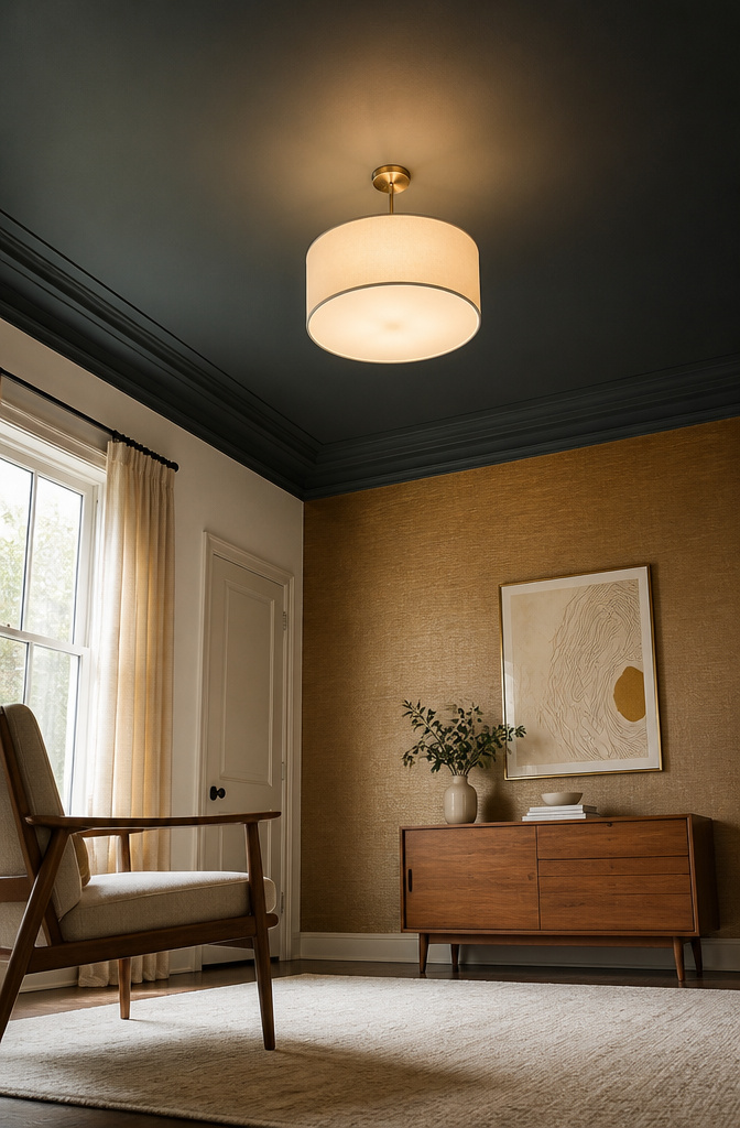
Ceilings spend most of their lives as blank drywall, but the fifth wall in a room with decent height is a chance to flip the whole feeling. Paint it darker than the walls and the space drops inward, cozy in a bedroom with too much vertical air. Go lighter and the room lifts, which sounds obvious until you stand in one that actually did it. Applied molding works the same way it does on walls, though the geometry gets tricky at the corners where planes meet. I tried textured wallpaper on a sloped dormer once, thinking the angle would hide any seams. Gravity and paste had other plans; the stuff sagged before it set, and peeling it off took an afternoon I had not budgeted. Ceiling work costs more in ibuprofen than in paint; an hour looking up is hard on the neck, and the ladder moves for every new section. Save this for a room you actually stand in long enough to notice.
13. Floating Shelves

Wall space does the heavy lifting when floor space is already claimed. A floating shelf keeps the look clean because the bracket hides inside the board itself, but that hidden hardware is where the whole project lives or dies.
The bracket type sets your real limit. A basic L-bracket screwed into a single stud might hold fifteen pounds if you are lucky. A toggle-anchor system rated for drywall spreads the load wider, though it still tops out lower than anything that bites into two studs. For a shelf of ceramics or small plants, only the two-stud mount gave me enough margin to sleep at night.
Six inches deep handles most books without tipping hazard. Ten inches swallows the woven basket you already own. Anything deeper than that should earn its place with a specific object in mind, not because the bigger board looked right in the store.
My own shelf came down because the stud finder lied, or I read it wrong, which amounts to the same thing after the crash. The ceramic bowl survived; the shelf did not. Now I drill a test hole to confirm wood before the bracket ever touches the wall.
14. Natural Materials and Finishes

Raw wood, stone, linen, and clay all give a room something factory-finish paint never will. They carry weight, temperature, and inconsistency. The grain in an unfinished oak shelf darkens where hands touch it most, which means maintenance is just oiling when it starts to look thirsty. I use beeswax cut with mineral spirits for touchable surfaces like table tops and handrails. It soaks in instead of sitting on top like polyurethane, so the wood still feels like wood under your palm. It needs reapplication every year or two, but the alternative is a plastic film.
Bamboo flooring came into the house on eco-credentials and price, and it is genuinely sustainable. The catch is that it scratches faster than oak under chair legs or dog claws. Felt pads under every piece of furniture are not optional. They are the cost of choosing it.
Linen and raw clay ceramics follow the same logic. They age visibly, which reads as warmth if you accept it and neglect if you do not. The current direction in eco-conscious decor leans into that honesty rather than hiding it. A chipped terracotta pot or a linen curtain that has softened at the fold line is the look now, not a flaw to replace.
15. Compact Room Design Hacks
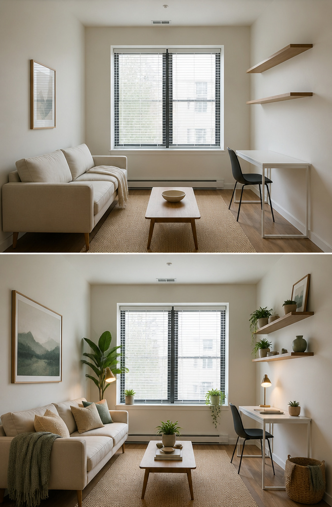
Small rooms punish the same furniture arrangement that works in a larger space. The first move that actually mattered in my own place was lifting storage off the floor. Wall-mounted shelves and tall cabinets draw the eye upward and keep the footprint clear for actual living.
Furniture with visible legs became my filter after that. A sofa or chair on slender legs lets light pass underneath, and the brain reads the room as larger than the square footage says. Solid-to-the-floor pieces swallow that same visual space.
I spent six months sketching a Murphy bed into my floor plan before pulling a tape measure to the ceiling. The hardware needs more clearance than I had. The idea died there, and the wall became shelving instead.
One rule I kept from that research: leave 60–70 cm of walking space around any bed, chair, or table you use daily. Less than that, and the room becomes an obstacle course you navigate instead of a room you live in.
16. Personalized Corners
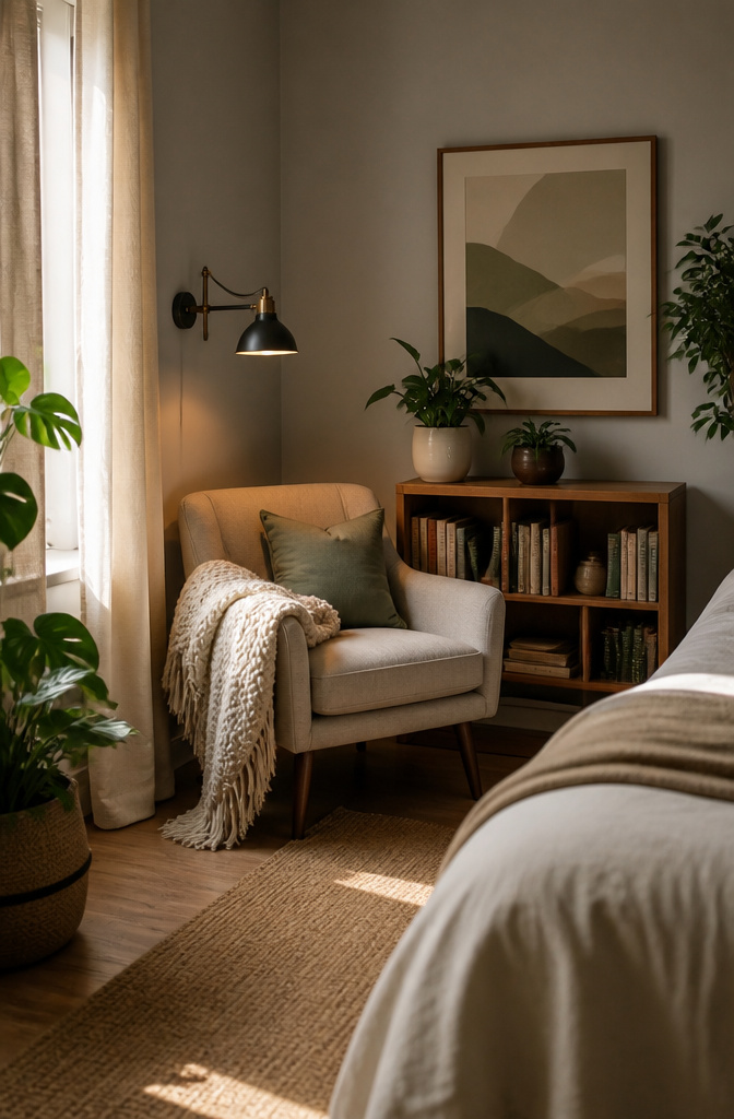
A reading chair dies without light that reaches the page. I learned that the hard way after two months of squinting through a novel in a corner where the nearest lamp sat six feet behind my shoulder. Task lighting should land within eighteen inches of where you actually hold the book, not somewhere in the room’s general direction. The fix was a $12 clip light from the hardware store, and the chair finally started earning its keep.
Vanity setups follow the same rule. The mirror matters less than the storage you can reach without getting up. I watched a friend mount a beautiful round mirror with no shelf nearby; her makeup now lives in a basket on the floor, which is where it stays most mornings.
The meditation corner I planned lasted eleven days. Morning sun blasted through that window at 7:20, turning the cushion into a griddle by 7:35. No amount of linen aesthetic made up for the sweat. The honest habit assessment came too late: I meditate after coffee, not before, and after coffee the sun has already won.
Personalization only works when it matches what you already do, not what you wish you did.
17. Cozy Nooks and Reading Spaces
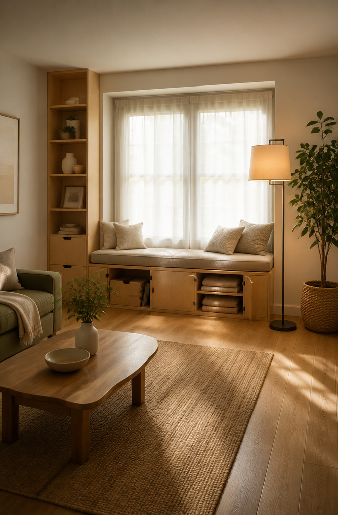
A window seat with storage underneath is the most useful small enclosure I have pulled off in a real room. The bench itself is straightforward: a plywood frame, a hinged lid, and a cushion cut to fit. The storage beneath swallows throw blankets and the books that otherwise pile on every flat surface. What makes it a refuge rather than just a bench is what happens overhead.
I once over-pillowed a corner so badly that sitting down meant relocating three cushions to the floor first. The lesson stuck: two pillows, maybe a light throw, and the space stays inviting instead of demanding maintenance before you can use it.
Fabric overhead changes the psychology completely. A simple curtain rod mounted to the ceiling, with linen or even a heavy cotton drop, turns a corner into something enclosed without walls. The fabric absorbs sound and softens the light that filters through, which matters more than most people expect.
Lighting is where these nooks live or die. Too dim and reading strains your eyes; too bright and the whole point of retreat evaporates. Aim for about the light of a 40-watt equivalent bulb at arm’s length, dimmable, with the source shielded so you are not staring at the bulb itself. A clip lamp with a fabric shade works. Wall sconces work better if you have the wiring. The goal is even, indirect light that lets you read without reminding you you are still in the room you needed a break from.
18. Functional Study Zones

A desk facing the wall quiets the mind faster than one facing a window. The window invites your eyes to drift; the wall keeps them on the task. I learned this the hard way after setting up a workspace in my bedroom, staring out at the neighbor’s oak for a year while deadlines crept closer and sleep grew worse. Work thoughts need a door that closes, and a bedroom desk has none. I moved it to the living room corner and reclaimed my rest.
Cable management splits into two schools. Visible raceways in a matching color blend with baseboards and cost little. Hidden channels inside hollow legs or behind drawer fronts take more planning but erase the clutter entirely. Either beats the snarl that collects under a bare desk.
Lighting layers matter more than the desk itself. A task lamp at 5000K keeps afternoon focus sharp. By evening, that same bulb feels like an interrogation, so dimmable fixtures or a secondary warm source carry the room into night without a headache. The switch costs under twenty dollars and saves your circadian rhythm.
19. Layered Lighting for Ambience

Ambient light from the ceiling fixture alone flattens a room into a waiting area. The fix is layering three types: ambient for general visibility, task for reading or working, and accent for mood. Each one has a job, and none of them should do another’s.
A dimmer switch on your main overhead fixture changes everything, and it takes about fifteen minutes with a flathead screwdriver if you flip the breaker first. The difference between full blast and dialed down to sixty percent is the difference between a clinic and a living room.
Lamp height matters more than lamp style. The bottom of a lampshade should sit at or just below seated eye level, roughly 60–66 inches from the floor. Any higher and the bulb stares you in the face; any lower and the light pools in a corner you aren’t sitting in.
String lights look effortless on Pinterest because no one shows the aftermath. Adhesive hooks failed on my bedroom wall by late July, dropping a whole strand behind the dresser during a humid stretch. Command strips rated for outdoor use or small nails into studs hold up where sticky backing gives up.
Accent lighting is where personality lives. A clip light aimed at a textured wall, a small uplight behind a plant, a cheap puck light stuck to the back of a bookshelf: these cost almost nothing and do what the overhead fixture cannot.
20. Textured Fabrics and Rugs
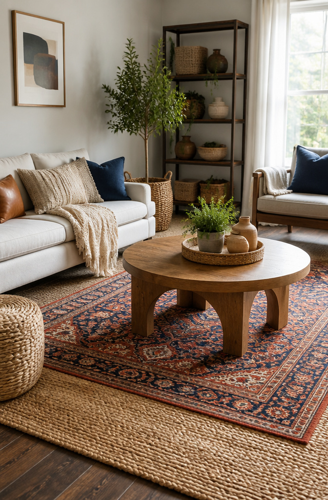
Wool underfoot feels different than cotton, and that difference matters more than the pattern printed on top. High-traffic hallways need the bounce-back of wool; cotton flattens faster but costs less and washes easier when the dog tracks mud through. Synthetics clean up quickest of all, though they never quite soften the way natural fiber does.
I learned the hard way that bigger is not automatically better. An 8×10 rug floating in a 9×12 room leaves awkward bare borders that make the whole space feel like a waiting area. The rug sat there for two years before I admitted the proportions were off. In a smaller bedroom, that same 8×10 would have anchored the bed perfectly.
Layering fixes a lot. A small patterned rug over a large jute base defines a reading corner without buying custom sizes. The catch is maintenance: every crevice in that top layer catches what a flatweave would let you sweep past. Vacuuming takes longer, and shaking out the small rug monthly becomes part of the deal. Texture gives a room life, but life includes dust.
Frequently Asked Questions
How can I decorate my room on a small budget?
Start with wall paint, floating shelves, or indoor plants for low-cost impact. A plywood headboard with foam and a staple gun comes together in an afternoon. Clip-on reading lights and peel-and-stick wallpaper let you change the look without contractor bills or permanent commitment.
What’s trending in room decoration right now?
Natural finishes, warm wood tones, eco-conscious decor, and multipurpose furniture lead the direction for 2026. Limewash paint and wood slat panels carry the texture focus forward, while pieces that do two jobs, like storage beds and nightstands with charging drawers, earn their square footage in smaller spaces.
How can I make my bedroom look bigger?
Place an oversized mirror opposite a window to pull daylight deep into the room and double the sense of space. Choose furniture with visible legs so light passes underneath, and keep 60–70 cm of walking space around the bed so the layout reads as open rather than cramped. Wall-mounted shelves and sconces lift storage and lighting off the floor, leaving the footprint clear.